|
A primitive, self-contained version of hypertext - one cell often achieves
its full effect only after you "link" it with another, not necessarily
adjacent, cell - the chart is an analog precursor of digital content, and
yet you hardly ever see charts at any of the usual-suspect webzines.
Perhaps their scarcity is due to the flat architecture that such
publications employ: Very few have tried to control the "flow" of the user's
experience in the way that print magazines do, wherein readers are gradually
prepped for longer, more substantive articles by way of lists, blurbs,
synopses, and charts. But it seems odd to abandon the chart simply because
links obviate the interface conventions of the print magazine; in a medium
where navigation often overwhelms apprehension, the demand for discrete,
superficial "content experiences" should be higher than ever.
In addition,
there are all the potential chart enhancements that the Web, with its
capacities for animation, hypertext, and data processing, makes possible.
This should be the Golden Age of the chart. There should be charts that
utilize user input, charts that simulate time, distance, and any other
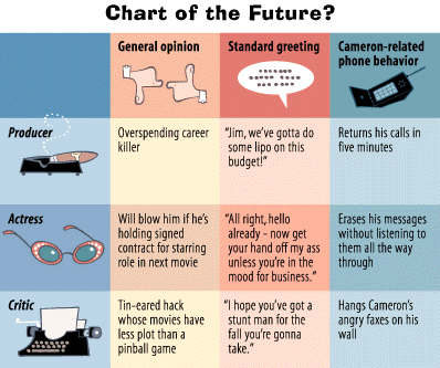
compelling variable. Imagine, for example, a chart that plotted the
entertainment industry's changing take on James Cameron. In such a chart, various topics would be ascribed to its columns and
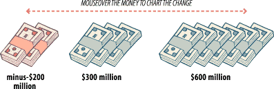
various industry figures would be ascribed to its rows. Buttons labeled with
various dollar amounts would appear at the bottom of the chart;
by dragging one's mouse over these buttons, the user could see
how the opinions of the industry figures "evolved" during Titanic's
journey
from overbudgeted catastrophe to the greatest sunken treasure ever.
Next ... Delete columnist, insert row.
 |
![[Previous Page]](/daily/98/08/14/prev.gif)
![[Next Page]](/daily/98/08/14/next.gif)